Typography
This is Kumbh Sans. Our brand typeface.
Kumbh Sans is the primary brand typeface for Security Infusion. Elegant and warm, this headline face projects trustworthiness, optimism, and sincerity.
Source Sans Pro is our supporting font.
Source Sans Pro was carefully chosen to support Kumbh Sans in headers for addition imformation. Usually used in h5 / h6 tags and uppercase letters.
Type Scale
Heading One
Heading Two
Heading Three
Heading Four
HEADING FIVE
HEADING SIX
Paragraph
Do's & Dont's
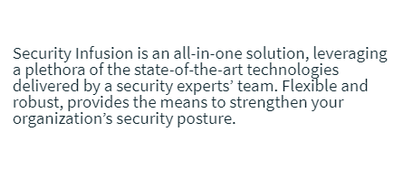
Line heights and spacing
Choosing the appropriate line spacing and letter spacing is very important to the reading quality and and efficiency of the typography. It should never be to open or too tight which makes reading difficult and unpleasant for the reader. While there is no perfect line height, a good rule of thumb is to set it at approximately 150% of the font size.
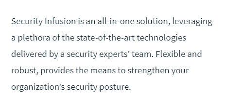
Choose the appropriate height and spacing depending on the font family and the font size
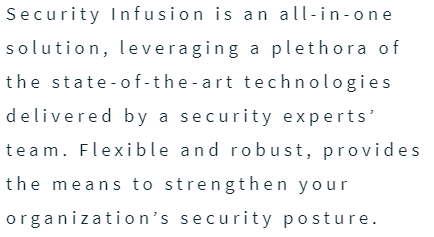
Incresing the the letter spacing on paragraphs will make them harder to read
When the line height is too tight, it undermines the horizontal reading flow and increases doubling
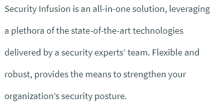
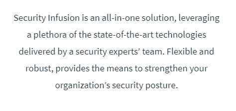
When the line height is too loose, lines of text visually float away from each other
Text alignement
Aligning text left is easier for the eye to follow, aids readability and organization. Promotion materials and illustrations are not excluded from this rule, unless specifically requested.
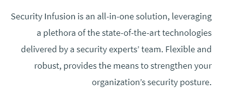
Always use left text alignement
Do not use right text alignement
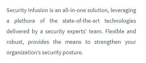
Do not use center text alignement
Do not justify text