Buttons
Buttons are categorized by importance and can be applied to a variety of html nodes. Each variation has intention and should be used accordingly.
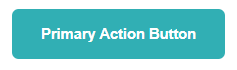
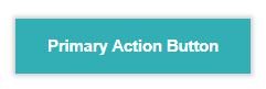
Primary buttons
Choose button according to the action and the background color.
</> Code
<button class="bttnWebAction"><h4>Primary Action Button</h4></button>
<button class="bttnWhiteAction"><h4>White Action Button</h4></button>
<button class="bttnBlackCancel"><h4>Cancel / Close Button</h4></button>
<button class="bttnDisabled"><h4>Disabled Button</h4></button>
Icon buttons
Buttons with major actions may include an icon before the text.
</> Code
<button class="bttnWebAction iconButton"><h4><img src="images/edit.png">Edit</h4></button>
<button class="bttnWebAction iconButton"><h4><img src="images/start.png">Start</h4></button>
<button class="bttnWebAction iconButton"><h4><img src="images/download.png">Download</h4></button>
<button class="bttnWebAction iconButton"><h4><img src="images/filter.png">Filter</h4></button>
<button class="bttnWebAction iconButton"><h4><img src="images/information.png">Information</h4></button>
<button class="bttnWebAction iconButton"><h4><img src="images/notifiq.png">Enable Notifications</h4></button>
<button class="bttnBlackCancel iconButton"><h4><img src="images/notifiq-stop.png">Disble Notifications</h4></button>
<button class="bttnBlackCancel iconButton"><h4><img src="images/close.png">Stop</h4></button>
<button class="bttnBlackCancel iconButton"><h4><img src="images/whiteBin.png">Delete</h4></button>
Status buttons
Used sparingly, only for major status notifications.
</> Code
<button class="bttnWebAction successBttn iconButton"><h4><img src="images/check.png">Ok / Success</h4></button>
<button class="bttnWebAction warningBttn iconButton"><h4><img src="images/warning.png">Warning</h4></button>
<button class="bttnWebAction criticalBttn iconButton"><h4><img src="images/close.png">Critical / Failed</h4></button>
Loading buttons
Important for some cases but bear similarities with disabled buttons. Use them with caution.
</> Code
<button class="bttnWebAction iconButton"><h4><img src="images/loader-light@2x.png">Primary Action Button</h4></button>
<button class="bttnWebAction iconButton"><h4><img src="images/loader-light@2x.png">Cancel / Close Button</h4></button>
<button class="bttnWebAction iconButton"><h4><img src="images/loader-light@2x.png">Disabled Button</h4></button>
Dont's
Security Infusion's buttons must be flat and simple with a design stripped down to basics.
Dont use border-radius
Dont use shadow effects