Form Elements
Forms are the line of communication that connects us with the users. Our design philosophy is to let form elements breathe in order to distinguish an element’s importance or priority. While removing white space and reducing inputs size may shrink scroll distance, it does more harm than good when it comes to a viewer’s understanding of form elements.
Input Fields
</> Code
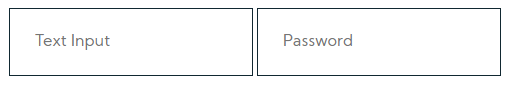
<input type="text" placeholder="Text Input" />
<input type="number" placeholder="Numeric Input" />
<input type="password" placeholder="Password" />
Select Dropdowns
</> Code
<select class="selectDefault">
<option>Option 1</option>
<option>...</option>
</select>
<select class="selectSearch">
<option>Option 1</option>
<option>...</option>
</select>
<select class="selectMultiple">
<option>Option 1</option>
<option>...</option>
</select>
Textareas
</> Code
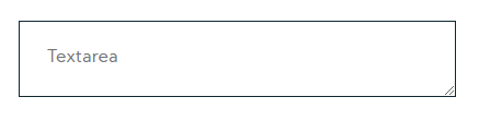
<textarea rows="4" placeholder="Default textarea"></textarea>
<textarea rows="4" class="noResize" placeholder="Textarea with fixed size"></textarea>
Checkboxes
</> Code
<div class="customCheck">
<input id="defCheck" type="checkbox">
<label for="defCheck" >Default checkbox</label>
<div>
<div class="customCheck">
<input id="linkCheck" type="checkbox">
<label for="linkCheck" >Checkbox with link</label>
<div>
<div class="customCheck">
<input id="preCheck" type="checkbox" <checked>
<label for="preCheck" >reselected checkbox</label>
<div>
Do's & Dont's
Let it breathe
Every field in a form must stand out, be big and wide so its imposible to miss and have at least 60 pixels height. Do not display fields next to eachother, every field must have the width of a row and a margin of at least 10 pixels top and bottom.
Do not display fields next to eachother
Textareas must be at least 4 rows wide