Tooltips
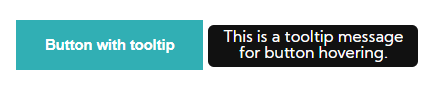
A tooltip is a floating, non-actionable label used to explain a user interface element or feature. We use tooltips for all the major actions of our system to improve user experience. Tooltips must be positioned above the element and their colour must contrast the background of the element.
 This is a tooltip message.
 This is a tooltip message for image hovering.
</> Code
<div class="tooltipButton">
<button class="bttnWebAction"><h4>Button with tooltip</h4></button>
<span class="tooltipInfoText">This is a tooltip message for button hovering.</span>
</div>
<div class="tooltipInfo">
<img src="images/info-sign.png" />
<span class="tooltipInfoText">This is a tooltip message.</span>
</div>
<div class="tooltipButton">
<img src="images/favBlue.jpg" />
<span class="tooltipInfoText">This is a tooltip message for image hovering.</span>
</div>
Do's & Dont's
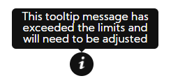
The tooltip text wraps when the content is wider than the max-width
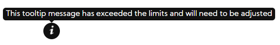
The tooltip message width must not exceed 210 pixels
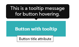
Never use tooltip and title attribute on the same element
Tootips are positioned only above elements for readability reasons